One website that works on every screen

Your customer views your site on a phone, a laptop or something in between. We design mobile-first, so content, buttons and forms stay clear and usable everywhere.

4.9/5 on Google26 reviews

Responsive design keeps the content clear on every screen.

A responsive website keeps its content and character, but adapts hierarchy, spacing, navigation and interaction to the available width.

What responsive design means in practice

The mobile version is not a by-product. From the start, it determines which content and actions take priority.

Mobile-first content hierarchy

Headings, text, proof and CTAs follow an order that stays logical on a small screen too.

Flexible components and images

Grid, typography and media scale without fixed desktop sizes. Images use appropriate formats and crops.

Tested with real interactions

Menus, forms, tables and horizontal rails are tested with touch and keyboard input at different widths.

Why mobile design requires more than a media query

A desktop layout can technically fit on a phone and still work badly. Long lines, small buttons, tables and heavy images require careful content, design and technical choices.

We check not only fixed device sizes but also the widths in between. We test important pages visually, use DOM measurements to catch overflow and sizing problems, and test the interactions. That keeps the experience usable as new screen sizes appear.

Work with a face of its own

Digital experiences that feel like the company behind them.

How we work together

Clear and personal: you always know what is happening, what I need from you and what the next step is.

  1. Initial conversation

    We discuss your business, your customers, the bottleneck and what the website or workflow needs to achieve.

  2. Choosing a direction

    You get a clear structure and visual direction, with choices I explain in plain language.

  3. Building and testing

    I do the build, share work in progress and check the content, speed, technical quality and mobile usability.

  4. Launch and follow-up

    After launch I stay available for maintenance, performance tracking, and targeted improvements.

No agency, but a senior team

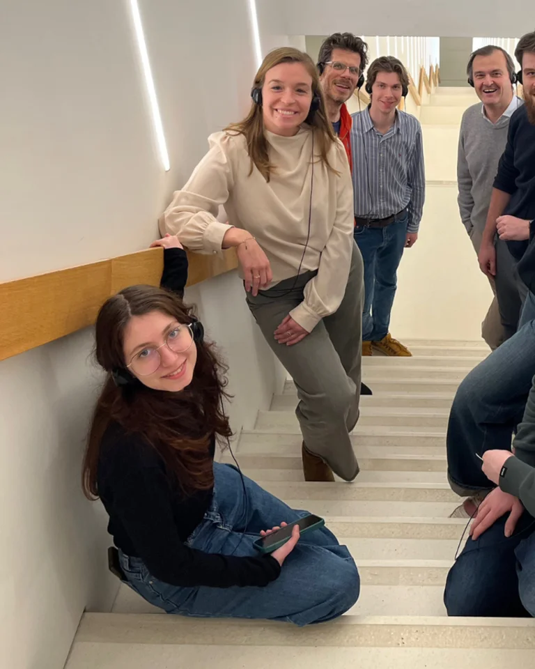
Seppe, freelance web developer and founder of Straffe Sites

At Straffe Sites you work directly with the team. Seppe stays your dedicated point of contact and builds your website; the team supports him with commerce, code and photography where needed. Communication stays direct, and your questions never get lost between account managers.

  • 25+ years of experience
  • 1 point of contact
  • Honest advice without a sales pitch
  • Worldwide clients, delivered remotely

Frequently asked questions

Straightforward answers before you decide whether this service fits your business.

What is responsive web design?

It is an approach in which layout, typography, images and interactions adapt to the available screen space without requiring a separate mobile website.

Is responsive the same as mobile-first?

Not quite. Responsive describes the result; a mobile-first approach starts the design and CSS with the smallest practical viewport and expands from there.

Can my existing website be made responsive?

Sometimes. First we check whether the HTML and CSS are flexible enough. With a rigid theme, a targeted rebuild can be more efficient.

Do you test on real phones?

Yes. Alongside testing at different browser widths, we check key journeys on real devices or realistic emulators.

Does mobile usability affect SEO?

A fast, usable mobile page helps visitors and contributes to the overall page experience. Strong content that answers their question remains just as important.

Glossary

Technical terms from this page, explained briefly and linked to the full knowledge base.

Does your website really work on mobile?

Send us your most important page. We’ll check where the content, navigation or interactions break down on small screens.

Discuss your project